
Statistics
Overview
The user can consume helpful visual and analytical charts like the count of active and inactive instances, clusters, their geographical locations, providers, cost, storage usage, vCPU and vRAM avg usage per hour.
Analytics dashboard on page
Can I look at the status and count of all my application VMs, in my project? - FAQ
Page navigation — Click on “All Projects“ and navigate to your project. You will be, by default on the project “Summary“ link in the left sidebar. Click on the “Applications” link in the sidebar on the left. You will be navigated to the “Applications” tab by default. Navigate to the “Statistics” tab.
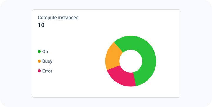
The first chart in the first column is a pie chart which provides the count of VMs or “Compute instances”. It also breaks down the count based on the different states of the VMs like “On”, “Busy”, “Error” etc.
How can I find the geographical location of all my application VMs? - FAQ
Page navigation — Click on “All Projects“ and navigate to your project. You will be, by default on the project “Summary“ link in the left sidebar. Click on the “Applications” link in the sidebar on the left. You will be navigated to the “Applications” tab by default. Navigate to the “Statistics” tab.
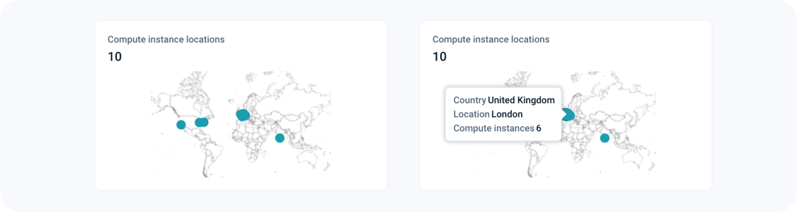
The world map helps you visualize the geographical location of all your VMs. If you hover over the highlighted locations, you can also find out the count of the VMs in that geographical location.
How can I see the breakdown of all my application costs based on VMs or cloud providers? - FAQ
Page navigation — Click on “All Projects“ and navigate to your project. You will be, by default on the project “Summary“ link in the left sidebar. Click on the “Applications” link in the sidebar on the left. You will be navigated to the “Applications” tab by default. Navigate to the “Statistics” tab.
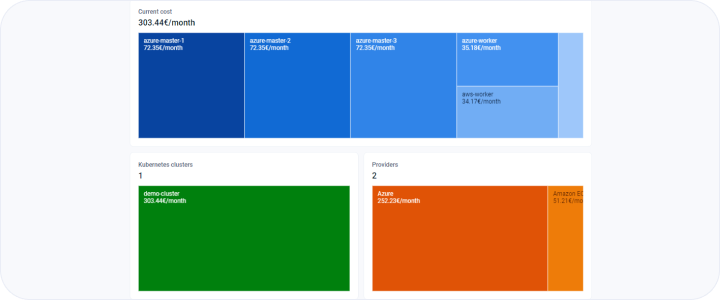
The first chart on the second column of the project statistics summary dashboard page provides a visual way of breaking down your costs in the form of a treemap chart. A treemap chart provides a hierarchical view of your data and makes it easy to spot patterns, such as which VMs or services or cloud platforms are costing you the most per month. There are three charts which break down costs based on:
- VMs defined in the project
- Cloud providers used in the project
Note: If you hover over the boxes in the cost breakdown by services or cloud providers, you can find out the count of the VMs in addition to the cost, from the tooltip.
How can I find out the usage of CPU, memory and storage for all my applications VMs in my project? - FAQ
Page navigation — Click on “All Projects“ and navigate to your project. You will be, by default on the project “Summary“ link in the left sidebar. Click on the “Applications” link in the sidebar on the left. You will be navigated to the “Applications” tab by default. Navigate to the “Statistics” tab.
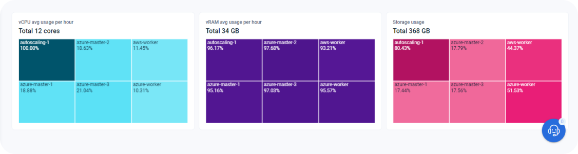
The bottom one-third of the page displays the usage of CPU, memory and storage for all your VMs and K8s VMs in your project. Each box represents a VM. The percentage mentioned in each box represents the percentage usage of that resource. The graphic also shows the total available resource at the top. The VMs need to be in an active and healthy state to return analytical data. This analytical data is then displayed in these graphics. So, if the VM is not active or in a shutdown/error state, emma will not be able to show meaningful data about that VM resource.
Last updated on 1 Aug 2026