
Project Cost Analysis
Overview
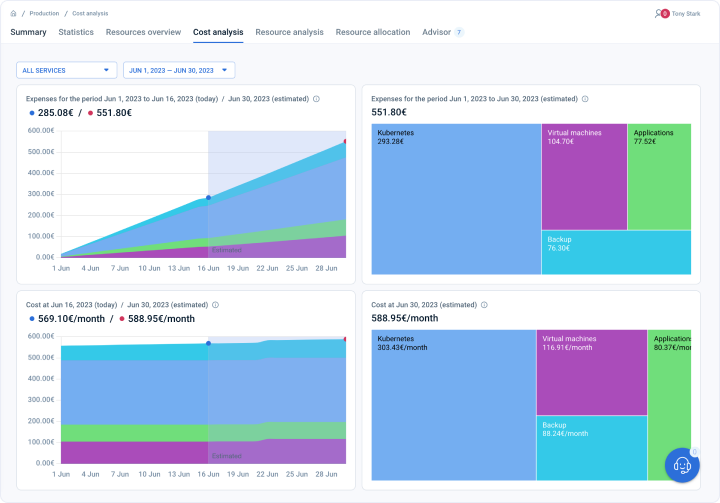
On this page, users can look at the cost and expenses breakdown against time and see the trends of how the cost or expenses are decreasing or increasing over time. User can also select the period for which he/she wants to look at the cost or expense charts. They can also select a custom period. emma platform provides a filter to look at cost and expense trends based on services as well.
Analytics dashboard on page
What is the difference between “cost” and “expenses”? - FAQ
On the “Project Cost Analysis summary” page we have two terms, cost and expenses which might sound similar and hence confusing.
By expenses, this page means the “absolute cost incurred” for the selected time period. If the selected time period ends in future, the absolute cost incurred will be predicted by emma’s ML model and displayed.
By cost, this page means the “cost per month rate“.
How can I find my current and predicted expenses and cost for my project or service? - FAQ
Page navigation — Click on “All Projects“ and navigate to your project. You will be, by default on the project summary tab. Click on the “Cost analysis” tab.
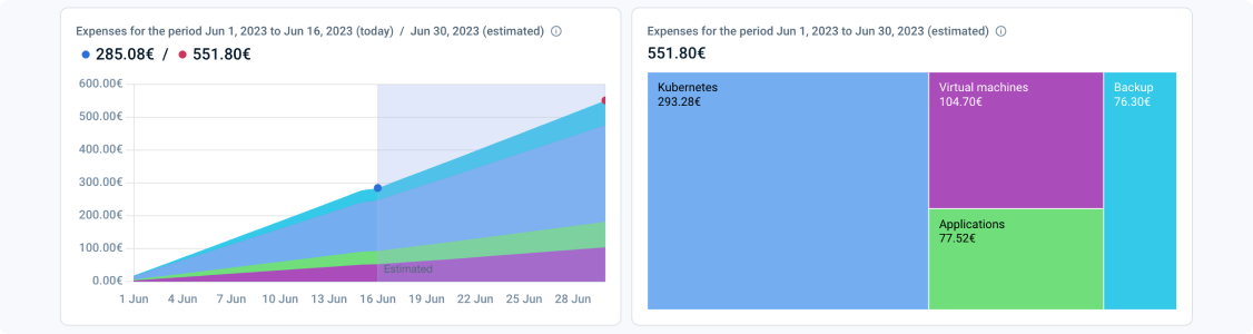
The first row of charts displays the expenses of the overall project (all services) or a specific project service based on the filter you select. By expenses, this page means the “absolute cost incurred” for the selected time period. If the selected time period ends in future, the absolute cost incurred will be predicted by emma’s ML model and displayed. The first chart in the first row is a stacked area graph. A stacked area graph is a type of data visualization that displays multiple data series as coloured areas stacked on top of each other, representing their cumulative contribution over time or across categories. It is useful for showing changes in data proportions over time or for comparing different categories but may make it difficult to compare individual series due to overlapping areas. In order to mitigate this issue, emma provides a filter at the top of the page so that you could just filter for individual services or a combination of them.
The second chart in the first row is a treemap chart. A treemap chart provides a hierarchical view of your data and makes it easy to spot patterns, such as which services have cost you the most.
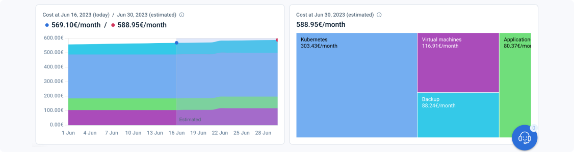
The second row of charts displays the cost of the overall project (all services) or a specific project service based on the filter you select. By cost, this page means the “cost per month rate“. If the selected time period ends in future, the cost rate per month incurred will be predicted by emma’s ML model and displayed. The first chart in the first row is a stacked area graph. A stacked area graph is a type of data visualization that displays multiple data series as coloured areas stacked on top of each other, representing their cumulative contribution over time or across categories. It is useful for showing changes in data proportions over time or for comparing different categories but may make it difficult to compare individual series due to overlapping areas. In order to mitigate this issue, emma provides a filter at the top of the page so that you could just filter for individual services or a combination of them.
The second chart in the second row is a treemap chart. A treemap chart provides a hierarchical view of your data and makes it easy to spot patterns, such as which services have cost you the most.
Last updated on 3 Aug 2023