
Project Resources Overview
Overview
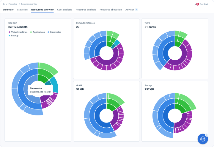
This page displays the total cost of all resources. Count of all the different types of resource categories is also aggregated on this page - Compute instances, Storage, vRAM, and vCPU.
Analytics dashboard on page
Where can I see the cost breakdown of VMs based on the hierarchy and organization of VMs? - FAQ
Page navigation — Click on “All Projects“ and navigate to your project. You will be, by default on the project summary tab. Click on the “Resources Overview” tab.
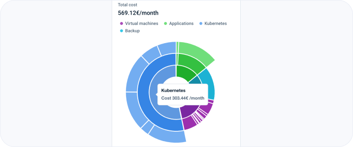
The first column shows the cost breakdown according to services. It also displays how are they structured for the different project services intuitively using a concentric or onion graph. The concentric circles or onion graph provides a visual representation of the hierarchical structure of different project services, allowing for an intuitive understanding of their (of VMs) organization and relationships within the overall project framework. This graphical representation aids in identifying key components, dependencies, and interconnections, facilitating effective project management and decision-making.
The concentric circles or onion graph can be conceptualized as a series of concentric pie charts. Each pie chart, ranging from the innermost to the outermost circle, represents the entire project cost.
In other words, the size of each pie chart reflects the proportionate cost allocation for different project services or components. This visualization allows for a clear understanding of how the project cost is distributed among various services or components hierarchically.
You need to hover your mouse on the graphs to look at the associated costs with individual “chunks/sectors” of the pie charts.
A pie chart, also known as a pie graph, is a circular graphical representation that displays data as “sectors” or slices. Each sector represents a proportion or percentage of the whole, with the size of the sector corresponding to the magnitude of the data being represented. The entire pie chart represents 100% of the data, and the sectors are usually labelled with the respective data values or categories. Pie charts are commonly used to illustrate data with discrete categories or to showcase the distribution of a single variable among different parts or components. They provide a visual and easy-to-understand way to convey relative proportions and make it simple to identify the largest or smallest sectors of the data.
The first level or the innermost circle of the pie chart represents the breakdown of the cost based on project services like Kubernetes, VMs, Spot Instances, Volumes, applications etc. The colour of the service is denoted by the legend provided. You can hover over the innermost circle to look at the service name and its associated cost. The sum of all the costs of each sector in the innermost pie chart is equal to the total cost of the project.
The second level pie chart shows the following info if you hover your mouse over it:
- In the case of deployed virtual machines - The individual VM names and their cost.
- In the case of the spot instances - The individual VM names and the cost associated with each of them.
- In the case of the volumes - The individual volume names and the cost associated with each of them.
- In the case of deployed applications - The name of the application, service name and cost involved in that specific application VM. The slices/sectors on the second-level pie chart will be broken down based on different applications deployed. For example, the tooltip will show the name of the application deployed like MongoDB or Redis. It will show the name of the application that you have given like “redis-app”. If no name is given, the system assigns a default name like “default-redis-app-name”.
- In the case of Kubernetes (K8s) clusters - The name of the K8s cluster, service name and cost involved in that specific K8s cluster. The slices/sectors on the second-level pie chart will be broken down based on different Kubernetes clusters deployed. For example, the tooltip will show the name of the Kubernetes cluster deployed like “model-training-k8s-cluster“ and the cost associated with that cluster. It will show the name of the K8s cluster that you have given. If no name is given, the system assigns a default name like “default-k8s-cluster-name”.
The third level or the outermost pie chart shows the name of the VM, its hierarchy (service name/ service instance name for example “Kubernetes / model-training-k8s-cluster”) and the cost associated with that individual VM.
How can I see the count breakdown of project VMs and vCPU cores based on the hierarchy and organization of VMs? - FAQ
Page navigation — Click on “All Projects“ and navigate to your project. You will be, by default on the project summary tab. Click on the “Resources Overview” tab.
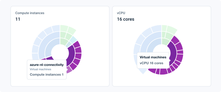
The first row of the second column shows all the VMs and the count breakdown according to services and their constituent VMs and vCPU cores. It also displays how are they structured for the different project services intuitively using a concentric or onion graph. The concentric circles or onion graph provides a visual representation of the hierarchical structure of different project services, allowing for an intuitive understanding of their (of VMs) organization and relationships within the overall project framework. This graphical representation aids in identifying key components, dependencies, and interconnections, facilitating effective project management and decision-making.
The concentric circles or onion graph can be conceptualized as a series of concentric pie charts. Each pie chart, ranging from the innermost to the outermost circle, represents the entire project count of VMs or vCPU cores.
In other words, the size of each pie chart reflects the proportionate count of VMs or vCPU cores for different project services or components. This visualization allows for a clear understanding of how the project resources are distributed among various services or components hierarchically.
You need to hover your mouse on the graphs to look at the associated counts with individual “chunks/sectors” of the pie charts.
A pie chart, also known as a pie graph, is a circular graphical representation that displays data as “sectors” or slices. Each sector represents a proportion or percentage of the whole, with the size of the sector corresponding to the magnitude of the data being represented. The entire pie chart represents 100% of the data, and the sectors are usually labelled with the respective data values or categories. Pie charts are commonly used to illustrate data with discrete categories or to showcase the distribution of a single variable among different parts or components. They provide a visual and easy-to-understand way to convey relative proportions and make it simple to identify the largest or smallest sectors of the data.
The first level or the innermost circle of the pie chart represents the breakdown of the count of VMs or vCPU cores based on project services like Kubernetes, VMs, Spot Instances, applications etc. The colour of the service is denoted by the legend provided. You can hover over the innermost circle to look at the service name and its associated count. The sum of all the counts of each sector in the innermost pie chart is equal to the total count of VMs or vCPU cores that are present in the project.
The second level pie chart shows the following info if you hover your mouse over it:
- In the case of deployed virtual machines - The individual VM names and their VMs or vCPU cores count.
- In the case of the spot instances - The individual VM names and their respective VMs or vCPU cores count.
- In the case of deployed applications - The name of the application, service name and count of VMs or vCPU cores in that specific application VM. The slices/sectors on the second-level pie chart will be broken down based on different applications deployed. For example, the tooltip will show the name of the application deployed like MongoDB or Redis. It will show the name of the application that you have given like “redis-app”. If no name is given, the system assigns a default name like “default-redis-app-name”.
- In the case of Kubernetes (K8s) clusters - The name of the K8s cluster, service name and count of VMs or vCPU cores in that specific K8s cluster. The slices/sectors on the second-level pie chart will be broken down based on different Kubernetes clusters deployed. For example, the tooltip will show the name of the Kubernetes cluster deployed like “model-training-k8s-cluster“ and the cost associated with that cluster. It will show the name of the K8s cluster that you have given. If no name is given, the system assigns a default name like “default-k8s-cluster-name”.
The third level or the outermost pie chart shows the name of the VM, its hierarchy (service name/ service instance name for example “Kubernetes / model-training-k8s-cluster”) and the count of VMs or vCPU cores in that specific VM.
How can I see the breakdown of project memory (vRAM) and storage based on the hierarchy and organization of VMs? - FAQ
Page navigation — Click on “All Projects“ and navigate to your project. You will be, by default on the project summary tab. Click on the “Resources Overview” tab.
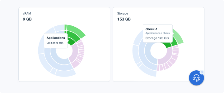
The second row shows the breakdown of total memory (vRAM) according to services and their constituent virtual machines. It also displays the storage breakdown for services, including their constituent virtual machines and volumes. It also displays how are they structured for the different project services intuitively using a concentric or onion graph. The concentric circles or onion graph provides a visual representation of the hierarchical structure of different project services, allowing for an intuitive understanding of their (of VMs) organization and relationships within the overall project framework. This graphical representation aids in identifying key components, dependencies, and interconnections, facilitating effective project management and decision-making.
The concentric circles or onion graph can be conceptualized as a series of concentric pie charts. Each pie chart, ranging from the innermost to the outermost circle, represents the entire project’s available memory or storage.
In other words, the size of each pie chart reflects the proportionate available memory or storage for different project services. This visualization allows for a clear understanding of how the project resources are distributed among various services or components hierarchically.
You need to hover your mouse on the graphs to look at the associated counts with individual “chunks/sectors” of the pie charts.
A pie chart, also known as a pie graph, is a circular graphical representation that displays data as “sectors” or slices. Each sector represents a proportion or percentage of the whole, with the size of the sector corresponding to the magnitude of the data being represented. The entire pie chart represents 100% of the data, and the sectors are usually labelled with the respective data values or categories. Pie charts are commonly used to illustrate data with discrete categories or to showcase the distribution of a single variable among different parts or components. They provide a visual and easy-to-understand way to convey relative proportions and make it simple to identify the largest or smallest sectors of the data.
The first level or the innermost circle of the pie chart represents the breakdown of the available memory or storage based on project services like Kubernetes, VMs, Spot Instances, Volumes, applications etc. The colour of the service is denoted by the legend provided. You can hover over the innermost circle to look at the service name and its associated available memory or storage. The sum of all the available memory or storage of each sector in the innermost pie chart is equal to the total count of VMs or vCPU cores that are present in the project.
The second level pie chart shows the following info if you hover your mouse over it:
- In the case of deployed virtual machines - The individual VM names and the available memory or storage associated with that VM.
- In the case of the spot instances - The individual VM names and the available memory or storage associated with that VM.
- In the case of the volumes - The individual volume names and the available storage associated with that volume.
- In the case of deployed applications - The name of the application, service name and available memory or storage in that specific application VM. The slices/sectors on the second-level pie chart will be broken down based on different applications deployed. For example, the tooltip will show the name of the application deployed like MongoDB or Redis. It will show the name of the application that you have given like “redis-app”. If no name is given, the system assigns a default name like “default-redis-app-name”.
- In the case of Kubernetes (K8s) clusters - The name of the K8s cluster, service name and available memory or storage in that specific K8s VM cluster. The slices/sectors on the second-level pie chart will be broken down based on different Kubernetes clusters deployed. For example, the tooltip will show the name of the Kubernetes cluster deployed like “model-training-k8s-cluster“ and the cost associated with that cluster. It will show the name of the K8s cluster that you have given. If no name is given, the system assigns a default name like “default-k8s-cluster-name”.
The third level or the outermost pie chart shows the name of the virtual machine or volume, its hierarchy (service name/ service instance name for example “Kubernetes / model-training-k8s-cluster”) and the available memory in that specific virtual machine or storage in that specific virtual machine or volume.
Last updated on 12 May 2025