
Statistics
Overview
The user can access helpful visual and analytical charts, such as the count of active and inactive Spot instances, their geographical locations, costs, and providers.
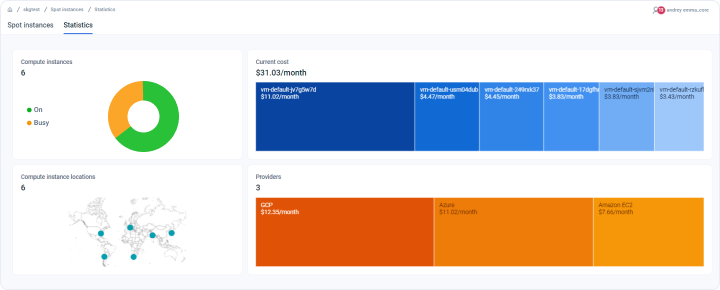
Analytics dashboard on page
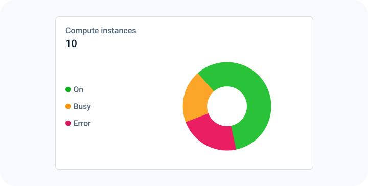
The status and count of Spot instances
The first chart in the first column is a pie chart that shows the count of Spot instances. It also breaks down the count by the different states of the instances, such as "On," "Busy," and others.
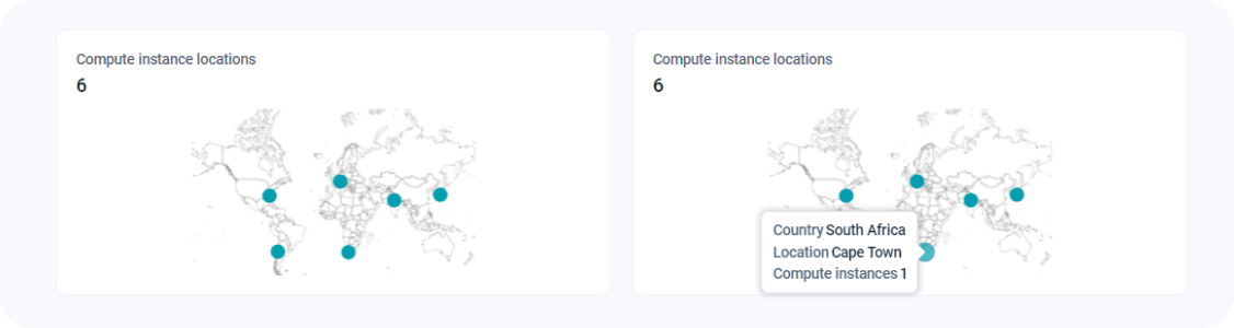
Geographical location of Spot instances
The world map helps you visualize the geographical location of all your Spot instances. If you hover over the highlighted geographical locations, you can also find out the count of the in that geographical location.
Cost breakdown insights with treemap charts
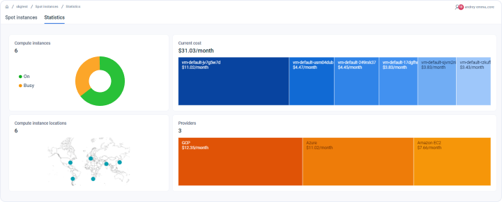
The first chart in the second column of the project statistics summary dashboard provides a treemap visualization for breaking down costs. A treemap chart offers a hierarchical view of the data, making it easy to identify Spot instances and providers incur the highest costs per month.
The dashboard includes three treemap charts to break down costs based on:
- Spot instances defined in the project
- Cloud providers used in the project
Note: Hovering over the boxes in the cost breakdown by cloud providers reveals a tooltip displaying both the count of Spot instances and the associated costs.
Last updated on 1 Aug 2026