
Company Expense analysis
Overview
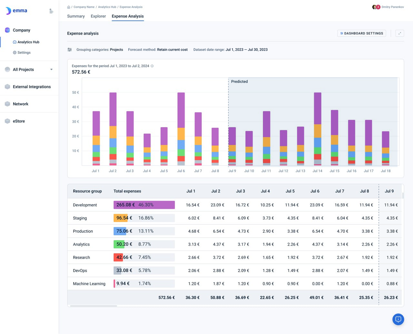
On this page, users can view trends over time for daily company expenses, allowing them to observe how expenses fluctuate on a daily basis. The dashboard provides a visual representation of expenses for a selected date range, with options to group the data by projects, services, providers, locations, tags, or a combination of these categories. The dashboard displays only data that users have access to read. For example, a user who is a member of projects A and B but not a member of project C would be able to see only summary information for projects A and B.
The table beneath the chart offers a detailed breakdown of expenses for each resource group, displaying the total expenses alongside the daily figures. Users can easily choose the time period they want to explore and adjust the grouping categories to focus on specific aspects of their cloud infrastructure expenses.
Analytics on this page
What does the “expenses” term mean? - FAQ
"Expenses" refers to the costs incurred by a company or project for using cloud services or resources during a specific period of time. These expenses typically include charges for infrastructure, services, and tools provided by cloud providers (such as AWS, Google Cloud, or Microsoft Azure)
Where can I find the expense history and total expenses for a specific time period? - FAQ
Page navigation — Navigation → Click on 'Company' and then go to 'Expense analysis' page
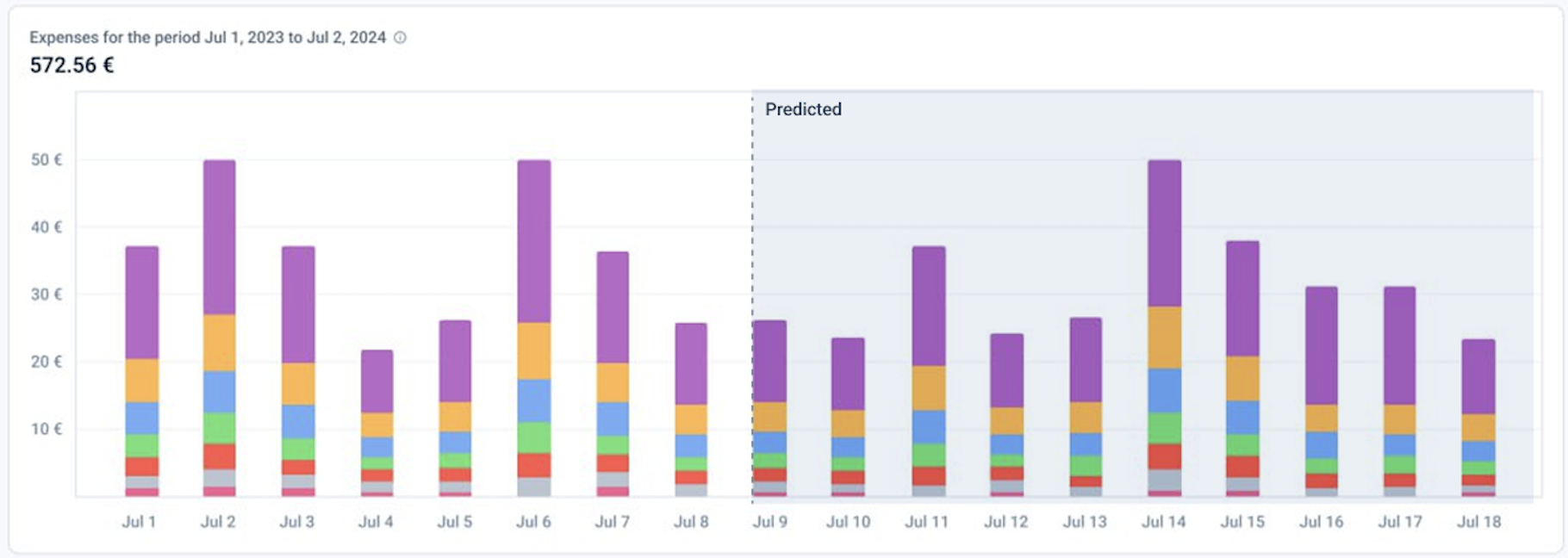
The bar chart at the top of the page visually represents daily company expenses over a selected time period. Each bar corresponds to the total expenses for a specific day, with different colors stacked vertically to denote the contribution of various resource groups (e.g., different projects or services) to that day's overall cost.
Key characteristics of the chart:
- X-axis (horizontal): Displays dates, representing each day within the selected time range.
- Y-axis (vertical): Displays the monetary value of expenses, with labeled increments to show the total cost for each day.
- Stacked bars: Each bar is divided into colored segments, with each segment representing the expenses for a specific resource group or category for that day.
- Color coding: Different colors are used to visually distinguish the resource groups, making it easier to identify which group contributed to the expenses on each day.
- 'Predicted' area: Presents forecasted expenses
This bar chart helps users quickly see daily expense trends and the distribution of costs across different resource groups.
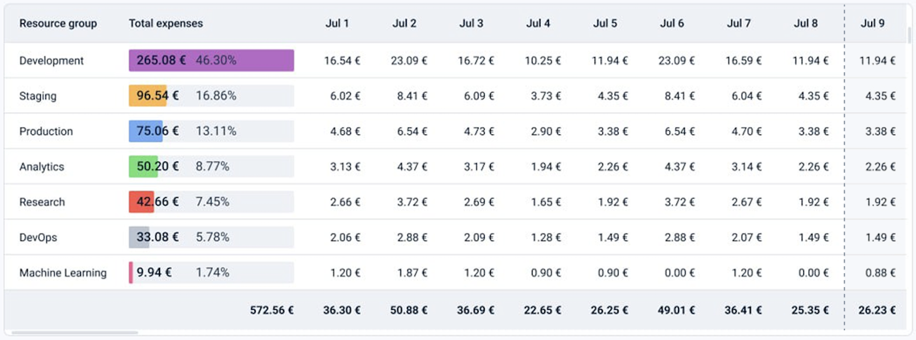
The table complements the visual representation by offering a detailed breakdown of daily expenses for each resource group, presented in columns organized by date. The "Total expenses" column summarizes the total expenses per resource group over the displayed period. Each row shows the individual expenses for the specified dates, with the total daily expenses provided at the bottom of each column.
This table helps users track spending trends, making it easier to monitor and control infrastructure costs across different cloud environments. The ability to group data by multiple categories allows for targeted insights, aiding in financial management and decision-making.
How can I change the grouping of my company expenses? - FAQ
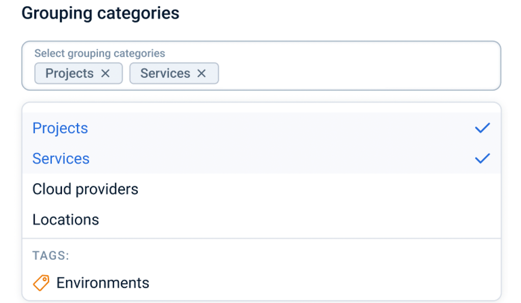
In your company, you may have multiple projects, each containing or having contained various products created across different cloud providers. You can adjust the combination of grouping categories to view your data from multiple perspectives
Page navigation — Navigation → Click on 'Company' → Go to 'Expense analysis' and then click on the Dashboard settings button
The dropdown menu includes the following options: Projects, Services, Cloud providers, Locations and Tags. You can select one or multiple grouping categories to apply to your data.
Note: You cannot apply a configuration without selecting at least one grouping category.
How can I change the forecasting method? - FAQ
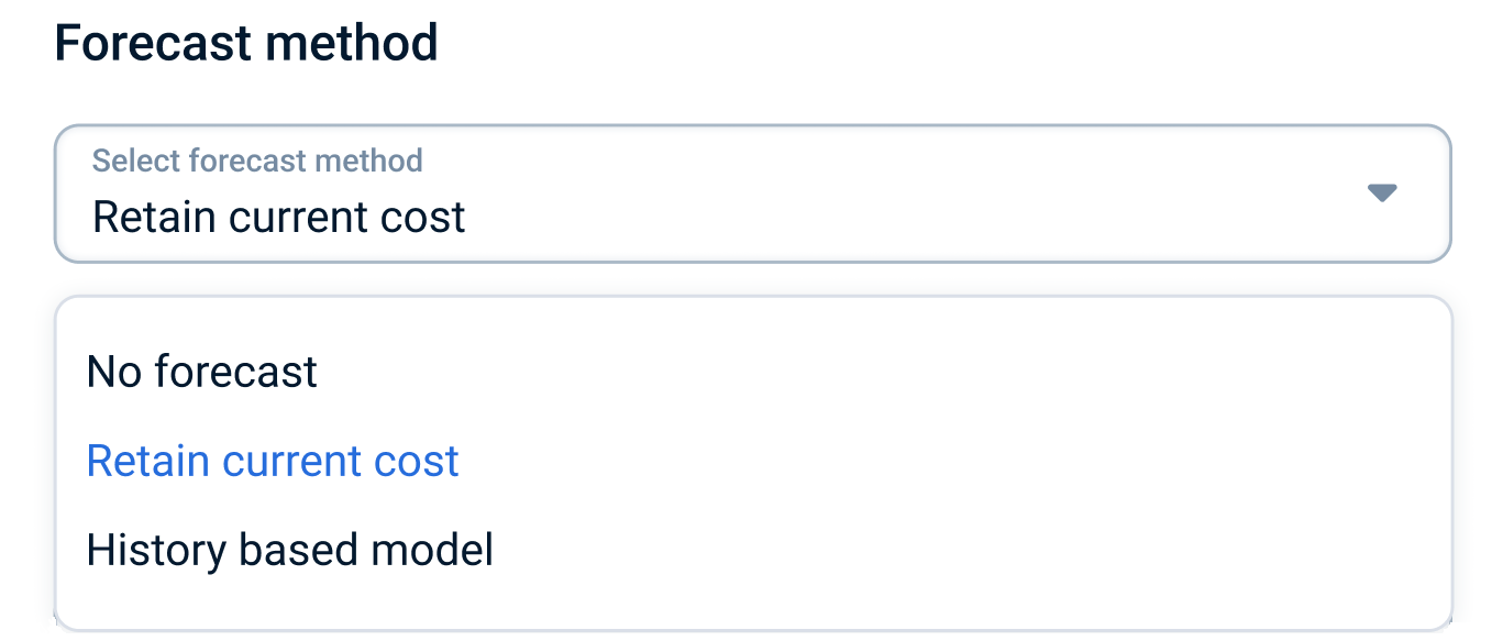
Use the forecast method selector to choose the most suitable forecasting approach.
Page navigation — Navigation → Click on 'Company' → Go to 'Expense analysis' and then click on the Dashboard settings button
The dropdown menu includes the following options:
- No forecast – Do not display any forecasted data.
- Retain current cost – Project the current infrastructure cost forward into the future.
- History based forecast - Forecast generated by the model based on the expense history.
How can I change the period I want to explore? - FAQ
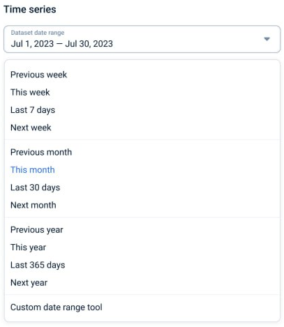
In your company, you may have a lengthy history of expenses. By using the dataset date range selection control, you can adjust the period you wish to explore.
Page navigation — Navigation → Click on 'Company' → Go to 'Expense analysis' and then click on the Dashboard settings button
The dropdown menu includes a list of presets, such as 'Previous week', 'This month', 'Next year', 'Last 7 days', etc., as well as a tool that allows you to request data for a more specific period—'Custom date range’
In this context:
- 'Previous' refers to the period immediately before the current one (e.g., 'Previous week' refers to the week before the current week).
- 'This' refers to the current ongoing period (e.g., 'This month' refers to the current month).
- 'Next' refers to the upcoming period (e.g., 'Next year' refers to the year following the current year).
- 'Last' refers to a specific backward-looking period from the current date (e.g., 'Last 7 days' means the previous 7 days including today)."
How can I filter products that are included in my company expenses? - FAQ
In your company, various products may be created across different projects, services, cloud providers, locations, time periods, etc. This filter allows you to refine and analyze these products by applying multiple conditions and parameters, providing deeper insights into the data displayed on the dashboard
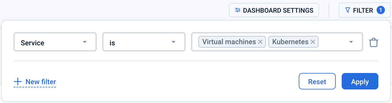
Page navigation — Navigation → Click on 'Company' → Go to 'Expense analysis' and then click on the Filter button
Choose and Apply Filters to the Table:
- First, select the parameter by which you want to filter the table
- When selecting "Tag" as Parameter, you will be presented with fields to specify the operator, key, and an optional value
- Leave the value field empty to find all products with the specified key, regardless of its value.
- Select 'No tag value' for the value field to find only products that have the specified key and an associated value that is empty.
- In the field that appears on the right, select the appropriate operator from the dropdown list
- Enter the value by which you want to filter or select from the proposed options
- Click the “Apply” button to apply selected filters
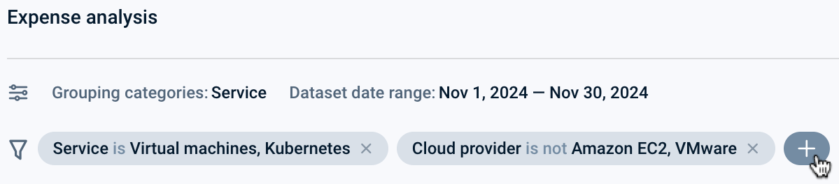
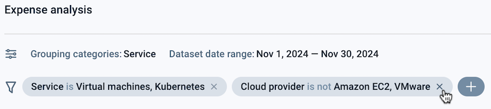
Applied filters appear in the bars above the charts

To filter by multiple parameters use one of two ways:
- in the “Filter” control, click the “+ New filter” button during the filters selecting
- click on the button on the right of the existing filter bar
To reset a filter use one of three ways:
- reset a single filter:
- in the “Filter” control, click the “Trash” icon on the right side of the filter, then click the “Apply” button
- click the “X” button on the corresponding plate
- reset all filters
- in the “Filter” control, click on the “Reset” button, then click the “Apply” button
Last updated on 1 Aug 2026